
August 12, 2026
Bad insurance UI can hurt both conversion and compliance. In embedded insurance, the best flows do 9 things well: place the offer at the right moment, explain coverage in plain language, show the full price early, use clear opt-in consent, keep quote steps short, support accessibility, show who stands behind the offer, make claims easy on mobile, test the flow often, and match the UI to the integration model.
Here’s the short version:
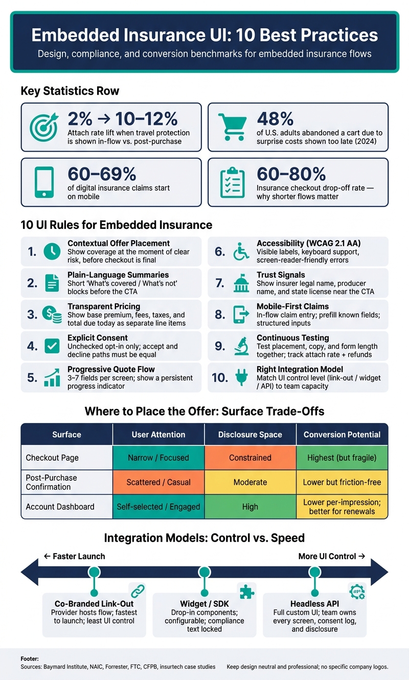
Embedded Insurance UI: Surface Comparison & Key Metrics
| Area | What I’d do | Why it matters |
|---|---|---|
| Offer placement | Show coverage right before checkout is final | Better timing can lift attach rate |
| Coverage summary | Put major exclusions and waiting periods near the CTA | Helps users make an informed choice |
| Pricing | Show premium, fees, taxes, and total due today | Cuts surprise costs and drop-off |
| Consent | Use an unchecked opt-in with plain wording | Lowers risk from dark patterns |
| Quote flow | Break long forms into short steps | Helps more users finish |
| Accessibility | Support keyboard use and screen readers | Makes the flow usable for more people |
| Trust signals | Show insurer, producer, and license info near buy actions | Reduces confusion about who offers coverage |
| Claims | Put claim entry inside the host app or site | Makes post-purchase help easier to find |
| Testing | Test placement, copy, and form length together | Finds what improves both clarity and conversion |
| Integration model | Match UI control to team capacity | More control means more work to maintain |
If I were building an embedded insurance flow in the U.S., I’d treat the UI as part of the product and part of the compliance work. That means simple copy, visible pricing, equal accept/decline paths, U.S. formats like $19.99/month and 08/12/2026, and mobile screens that are easy to finish.
Insurance is not a standard add-on. It asks for personal data, ongoing premiums, coverage terms, cancellation rules, and claims support that matters most in hard moments like accidents, illnesses, or travel disruptions. That changes the stakes. And it sets a much higher bar for every UI choice.
A standard add-on is usually low risk. Insurance isn't.
An insurance offer asks users to trust a regulated product, share sensitive information, and agree to terms that can shape their financial protection. So the UI has to do more than persuade. It has to inform.
Embedded insurance flows need to show underwriting, distribution, state disclosures, licensing, and eligibility details clearly and accurately in the interface itself. If those details are wrong or missing, coverage validity can be affected and regulators may step in. That difference shapes every embedded insurance screen that comes next.
Because the stakes are higher, the UI also needs U.S.-specific formatting and accessible patterns built in from the start.
Use U.S. formatting and WCAG 2.1 AA patterns in every embedded insurance flow: USD pricing, MM/DD/YYYY dates, 12-hour time with time zone, American spelling, clear labels, keyboard access, and screen-reader-friendly errors. For example: $19.99/month, $250 deductible, effective date: 08/10/2026, (Submit by 5:00 PM PT on 08/15/2026).
Form fields need plain, direct labels, such as "Date of birth, MM/DD/YYYY". Error messages should say exactly what went wrong and be announced to screen readers. Consent checkboxes should work by keyboard, not just by mouse. That cuts friction and helps lower compliance risk.
A high attach rate means little if the customer didn't understand what they bought.
When teams design only for conversion, they often drift toward pre-checked opt-ins, buried exclusions, or other dark patterns. That may help in the short term, but it can lead to complaints and regulatory scrutiny later. It's the old story: easy win now, hard problem later.
The better goal is simple: make it easy to accept, and just as easy to understand what the user is agreeing to. Consent elements should sit close to the related details. The final confirmation screen should restate the price in USD, the term length, and major exclusions. And there should be a visible Learn more path that doesn't force users to leave the flow.
The next sections turn those ideas into specific UI patterns.
Once the integration is live, placement decides whether the offer feels helpful or annoying.
Contextual placement means showing coverage at the exact moment a person runs into a clear risk. For example, device protection when someone adds a $1,200 laptop to their cart. Trip protection when they review a flight itinerary right before payment. Income protection during a fintech app’s plan selection step. The timing matters because the need is right in front of them.
The data backs that up. When travel protection is shown in-flow at the moment of deposit, attach rates can jump from a 2% baseline to 10%–12%. That’s about 6x higher than generic post-purchase emails.[4] The lift came from timing.
Place the offer after a major decision and before checkout is final.
Pre-checked boxes, low-contrast decline text, and countdown timers on coverage offers are red flags. Users don’t like them, and U.S. regulators don’t either. If someone wants to decline coverage, that should be just as easy as saying yes. Clear microcopy helps set the tone early, like Insurance is optional and does not affect your ability to complete this purchase. Once the offer shows up at the right moment, the copy needs to make the coverage easy to understand.
Once placement is set, the next job is simple: tell people what the policy covers, what it doesn’t, and how it works. Fast.
Plain-language coverage summaries do exactly that. They give short, direct explanations of covered events, exclusions, and core terms. In embedded insurance, that matters a lot because people often make the call in seconds, not after reading a long policy packet. NAIC training materials report that 79% of insurance communications are not readable, and hard-to-read copy can chip away at trust and lead to complaints.[12] Plain language helps people find, understand, and use the information they need without digging.[9][11]
In plain English, that usually means:
Good wording is only half the job. The layout also needs to put the big limits front and center before someone clicks through. A layered layout works well here: a short value statement, then a scan-friendly block with "What's covered" and "What's not covered," followed by a link to the full details. Forrester data shows that at least 90% of insured U.S. adults want clearer messages from their insurer, especially about covered services and costs.[10] Putting that clarity at the point of sale can cut confusion, complaints, and claims of mis-selling.
The biggest risk here is dark patterns. If a major exclusion or waiting period is tucked inside an easy-to-miss tooltip, the customer is not giving informed consent.[7] Material limits need to be obvious, plain, and visible without extra clicks. Put major exclusions and waiting periods next to the CTA before the customer confirms. The same standard should follow the customer through quote, consent, and bind screens.
Walnut Insurance supports this with configurable, compliance-reviewed copy templates and UI kits that keep summaries consistent while still allowing channel-level edits. Teams can change product names, price ranges, and the amount of detail by channel without rewriting legal text.
After you explain what the coverage includes, the next thing people want to know is plain and simple: what will this cost me?
This is where trust can either hold up or fall apart fast. Baymard Institute found that surprise costs shown late in the flow are a top reason people abandon checkout. And in a February 2024 survey, 48% of U.S. adults said they abandoned an online cart because extra costs were too high or showed up too late.[13] So if someone sees $5/month on the offer card and $8.99 on the confirmation screen, it feels misleading - even if the gap comes from taxes or a policy fee.
The fix is pretty straightforward. Show the base premium, fees, estimated taxes, and total due today as separate, visible line items before the customer commits. If the coverage renews, put the billing cadence right next to the price. Don’t hide it in a tooltip or a terms link. U.S. regulators have been clear here: the FTC and CFPB treat drip pricing and late fee disclosure as deceptive, and the CFPB says the total price should be disclosed before people hand over personal information or get deep into an application.[6][5][16]
The total cost needs to be visible before the user says yes. Pre-checked insurance add-ons with fuzzy pricing, vague “as low as” language without a final number, and fees that appear only on the last confirmation screen all chip away at trust.[15][17] The better approach stays the same each time:
Once the full price is clear, repeat it at the points where people make decisions, double-check details, and later manage the policy. Show it next to the product option, in the cart summary as its own line item, and again on the review screen before final confirmation. For recurring coverage, use that same format in account and billing pages too. When the number stays the same across every surface - app, email, partner page - you cut down on confusion that can lead to cancellations and chargebacks.
To keep pricing aligned across surfaces, use one configurable pricing block. Walnut Insurance lets businesses ingest pricing data through API or set up no-code and widget-based experiences where premium, fees, and totals follow pre-vetted display patterns - so partners keep brand flexibility without risking mismatched pricing across surfaces.
Once the price is clear, consent needs to be explicit. The customer should confirm the exact offer already on screen. It has to be visible, tied to that specific coverage, and easy to tell apart from a generic agreement.
U.S. regulators are direct on this point. The FTC has warned that dark patterns - such as hiding decline options or burying material terms - can be deceptive.[18][22] State insurance rules also bar companies from adding optional coverages automatically without express consent, and they often require proof of that consent to be kept for at least three years.[19] A pre-checked insurance box isn’t a shortcut. It’s a compliance risk.
Design matters just as much as the rule. Research on consent interfaces found that dark patterns increased acceptance of tracking by 8–23 percentage points without improving user understanding.[20] That might look good in a conversion report. But it can also hide confusion and lead to disputes later.
After the price and coverage summary are visible, the consent step should confirm the choice without adding extra drag. Use an unchecked, explicit opt-in. For example, use a checkbox or toggle with clear language like "Add trip protection insurance for $9.99 (optional)" instead of a vague “I agree to terms” folded into a generic continue button. The consent control should appear next to the same premium, term, and coverage details shown earlier, so the customer is confirming one clear offer.
For disclosure, a layered approach works well: a plain-English summary of what’s covered and what isn’t, plus a clearly labeled link to the full policy document. That keeps the flow moving without hiding material terms. Electronic delivery only works when the customer opts in.[1][21]
Walnut Insurance supports configurable consent components across no-code, widget, and API integrations, with automatic logging of what was shown, when it was shown, and how the user responded.
Once the price and consent are clear, the next job is simple: make the quote-and-bind path feel easy to finish.
That matters because insurance checkout drop-off can reach 60%–80%[26], and about 30%–40% of users leave right after they see the premium.[24] In plain terms, people don’t just quit because insurance is hard. They often quit because the flow asks for too much, too soon.
A progressive flow helps by turning one long process into short, manageable steps. Keep each screen to 3–7 fields, group related questions together, and show a persistent progress indicator. If a flow has six or more fields, and the questions fit into natural groups, research on multi-step form design shows this setup tends to beat a single long page.[25]
There’s also a pricing angle here. One insurtech case study found that moving away from showing the full premium upfront and instead revealing the premium in line-item stages dropped abandonment at the pricing step from 38% to 12%.[23] That’s a big swing. For many users, a staged reveal feels less like hitting a wall and more like walking through the cost piece by piece.
The right step depth depends on where the user is. In a retail checkout, the insurance step should stay light - usually one or two questions max - with the rest pushed to a post-purchase touchpoint. In a SaaS onboarding flow, where risk profile may be part of setup from the start, more detailed questions can fit earlier without feeling random. The point is to match the insurance flow to the time and attention the customer is willing to spend right then.
Disclosures should follow that same pattern. Instead of dumping everything onto one final screen, place short disclosures inside each step, then confirm the exact coverage, price, and limits on the final review screen. That keeps required information visible when it matters, not buried at the end. It also helps to prefill known fields from the host platform. Less typing means less friction, and less friction means a better shot at getting the policy bound.
Walnut Insurance supports step-based quote-and-bind flows across no-code, widget, and API integrations, with conditional branching, prefill, and analytics.
Once the quote flow is split into steps, accessibility becomes the thing that determines whether people can finish. In embedded insurance, that point is hard to ignore. Users are making legal and financial choices inside another product journey, and they still need to read disclosures, review details, and give consent. If the interface gets in the way, people don’t just get annoyed - they drop out.
The numbers back that up. In one insurance quote form redesign, abandonment dropped from 63% to 33%, and average completion time went from about 30 minutes to 9–12 minutes.[32] Put simply, poor insurance UI hurts completion and conversion across the whole flow.
For forms, each field needs a visible label that is connected in code to the right input. Placeholders are not labels. Required fields should use plain text such as "(required)", not only an asterisk or a color shift. On submit, focus should move to an error summary or the first invalid field. Each inline error should also be tied to the field with aria-describedby and role="alert" so screen readers announce it right away.[28][29][31]
WCAG success criteria 3.3.1, 3.3.3, and 3.3.4 matter a lot here because insurance forms involve financial and legal commitments.[8][30]
Navigation needs the same level of care. Tab order should match the visual order on the page, and focus should never get stuck inside a modal or widget. ARIA landmarks and clear headings help screen reader users jump straight to the insurance section instead of wading through the full page. Back buttons should also say exactly where they go, like "Back to Coverage Questions." That applies whether the insurance step sits inside checkout, onboarding, or a widget.
Consent controls need this same treatment. That includes:
Walnut Insurance includes these patterns across its no-code, widget, and API options.
Once usability is in place, credibility becomes the next hurdle. People need to know who is behind the offer before they click. That means showing the insurer’s legal name, the licensed producer or agency name, and the state license number right next to the buying decision - not buried in the footer.
Put this information on quote screens, next to add-coverage buttons, and beside any purchase prompt.
A simple way to handle it is a short, labeled block near the main CTA. For example, Coverage underwritten by [Carrier Legal Name] and offered by [Agency Name], a licensed insurance producer. Carrier logos can help, but they should back up the text, not stand in for it. The host brand can stay front and center, but the carrier and broker still need clear labels beside the CTA.[33][2][34]
After the issuer is clear, give users the few details they need to size up the offer fast. Show key exclusions, cancellation rules, and whether added coverage is optional right next to the offer. A short set of 4–6 plain-language highlights works well inline, with a link to the full policy terms for anyone who wants the fine print.
One point matters a lot here: don’t make optional coverage look required. That’s the kind of dark pattern regulators go after.[14][27][35]
Walnut supports fixed trust blocks across no-code, widget, and API builds, so carrier, broker, and disclosure text stays consistent across each surface.
After someone buys, the job of the UI changes. It’s no longer about conversion. It’s about helping people recover when something goes wrong. And that matters on mobile most of all: about 60%–69% of digital claims start on mobile, and mobile claims can cut processing time by nearly 50%.[41][42] So if claims and policy servicing aren’t designed mobile first, you’re making users step out of the flow they’re already in.
The first claims screen should feel like a direct continuation of the purchase path. That means in-flow placement. Claims and servicing should live inside the host experience, not in some separate portal that feels disconnected. If a user bought device protection during checkout, the File a claim button should show up on the order detail screen, not hide three menus down. Known details should already be filled in, like order ID, purchase date, and item description. UX research shows that mobile-first workflows can cut average claim submission time by 35%, and asynchronous photo upload can reduce form abandonment by up to 28%.[40]
For the claim flow itself, keep it short and guided. On a phone, long open text fields are where momentum goes to die. Use structured inputs instead:
Make tap targets large enough for one-handed use, and make error messages specific. A progress label like Step 2 of 5 helps people understand where they are and what’s left. Before asking for submission, show coverage confirmation in plain language. For example: You're covered for trip delay up to $1,000. Common coverage and policy-change tasks should take one or two taps, not a maze of screens. Coverage limits and deductibles should also use standard U.S. formatting, like Coverage limit: $2,000; Deductible: $100.
Claims screens need the same level of clarity and consent discipline as purchase screens. Don’t dump every disclosure onto one screen. Layer them. Put the key notice, such as Submission is not approval, close to the main action. Full legal text can sit behind a clearly labeled link or accordion. Consent checkboxes should cover one thing only and stay unchecked by default. Regulators and consumer advocates have called out dark patterns in mobile insurance flows, including hidden claim entry points and misleading progress indicators that make submission look like approval.[36][37][38][39] Filing a claim should be just as easy to find as any other servicing action on the screen.
These patterns also need to hold up across no-code, widget, and API builds. Walnut's no-code, widget, and API options support mobile-first servicing, from prebuilt responsive claim forms to fully custom mobile UIs.
Launch isn't the finish line. It's where optimization starts.
What works once may not keep working at scale. If you want attach rates to climb over time, you need steady testing. And that testing has to look at placement, copy, form length, and disclosure together - not one piece at a time. In embedded insurance, attach-rate targets often land between 5% and 25%, depending on the vertical. And in one documented case study, a partner's attach rate moved from 5% to 12% after changes to offer design and placement.[47][46]
The best tests usually focus on three areas:
Start with the moments that have the biggest effect on intent and completion. Placement tests should line up with clear user milestones. Device protection belongs at electronics checkout. Trip insurance fits at booking confirmation. It's also smart to test timing across checkout, confirmation, onboarding, dashboards, and follow-up email.
Copy matters more than people think. A/B testing a headline like Protect your trip from cancellations against more neutral wording can improve comprehension and trust, especially for U.S. consumers who may already be wary of insurance add-ons. Form design matters too. Every extra field adds friction. Cutting fields, cleaning up layout, and using progressive disclosure can lift conversion by 10% to 50%.[43]
Just don't measure disclosure delivery and call it a day. Test whether people actually understand what they saw. A short comprehension prompt after the summary can help verify that understanding. Then compare those comprehension results with attach rate and support volume. That gives you a much clearer picture of what's happening.
Dark patterns are a terrible shortcut. They can make acceptance look higher on the surface, but the story changes once abandonments are counted. The FTC and CFPB, along with several states, have moved toward explicit rules against pre-ticked boxes, drip pricing, and hard-to-cancel negative options.[44][45] If a test lifts attach rate but also drives up refunds, complaints, or support tickets, roll it back.
Those same guardrails should stay in place for every experiment. Walnut Insurance supports iteration by locking disclosures, required fields, and state-specific language while teams test copy, placement, and layout. Over time, small and steady gains can add up across high-volume partner channels.
Use the right surface at the right time. Checkout, post-purchase confirmation, and the account dashboard each come with a different mix of attention, room for disclosures, and risk to conversion.
Once the offer itself is set, placement becomes the next call. And that choice matters more than it may seem at first glance. A checkout page can drive more opt-ins, but it also leaves very little room for error. A dashboard gives you more space, but fewer people will act on the offer in that moment.
The table below shows the trade-off between timing, space, and friction.
| Surface | Relevance Timing | User Intent and Attention | Disclosure Space | Intrusiveness | Conversion Impact |
|---|---|---|---|---|---|
| Checkout page | Immediate and contextual; the offer ties directly to the purchase | Narrow; users are focused on price, payment, and getting through checkout | Constrained; use short plain-language summaries inline, with full terms behind a link or pop-over | Highest if poorly designed; lower with neutral defaults, clear optional labeling, and no pre-checked boxes | Highest attach-rate potential, but aggressive or poorly designed offers can increase abandonment and hurt checkout completion |
| Post-purchase confirmation | Post-decision; the purchase is complete, but the risk moment is still fresh | Scattered; users scan secondary details more casually | Moderate; a short coverage overview and links to full policy terms fit well | Moderate; lower than checkout because the core transaction is done | Lower immediate opt-in than checkout, but effective for upgrades without adding friction to the primary transaction [48][49] |
| Account dashboard | Ongoing and situational; often tied to renewals, changes, or lifecycle events | Self-selected; users who navigate here are already engaged | High; policy details, FAQs, notices, and servicing tools can fit naturally | Lowest; users expect to manage products and settings here | Lower per-impression conversion, but supports longer-term uptake and more thoughtful decisions |
Post-purchase confirmation is a good fit for follow-up offers that shouldn't get in the way of checkout. The account dashboard works better for renewals, plan changes, and education.
Placement also shapes the kind of copy you should use. When attention is tight, keep it short and direct. When people expect more detail, give them more detail.
| Copy Element | Clear Version | Unclear Version |
|---|---|---|
| Headline | Protect your new laptop from accidental damage | Add protection |
| Price line | $7.99/month, billed with your subscription | From 7.99* |
| Disclosure line | Covers accidental damage; does not cover loss or theft. See full terms. | Subject to terms and conditions. |
A simple way to think about it: tighter surfaces need tighter copy. At checkout, every word has to earn its place. In a dashboard, users are more willing to read policy details, FAQs, notices, and servicing information before they decide.
These UI rules apply across all integration models. What changes is how much control your team keeps and how fast you can ship updates.
A co-branded link-out flow is a solid starting point if you want to test demand without putting engineering time on the line. You can place a "Get coverage" button on an order confirmation page or a "Protect your purchase" link in an account dashboard, then send users to a hosted flow run by the insurance platform.
The provider handles disclosures and consent capture. Your team should focus on a few basics: set expectations before the handoff, keep branding aligned with logo pairing and color choices, and pre-fill context like product type or account details so people don’t have to type the same information twice.
If the hosted flow shows dates or times, use U.S. formatting. Show pricing in USD ($). This model fits best when speed matters more than deep UI control.
Widgets and SDKs sit in the middle. They give you more control than a link-out, but they don’t ask your team to build every screen from scratch.
You can drop configurable components straight into your existing pages, such as:
Product teams control placement and decide which fields to collect. The SDK takes care of validation, premium calculations, and disclosure order. Theme settings can match your design system for colors, typography, spacing, and buttons, while compliance text stays locked.
When the insurance platform updates a disclosure or consent pattern, that update ships with the next library release. This model works well when you want a configurable UI without taking on every compliance detail yourself.
A custom front end built on headless APIs makes sense when insurance is part of the core product, not just an extra offer. Ride-sharing, travel, and fintech apps often land here because the insurance step needs to feel like a natural part of the full journey.
But there’s no sugarcoating the trade-off. Your team owns every screen state, accessible form, consent log, price display, state-specific disclosure, and analytics event. The API handles rating, quoting, underwriting, and policy issuance. Everything between those steps is yours to build and maintain.
Use APIs only when the insurance experience needs to feel native and your team can support the full surface over time.
As you move from a hosted flow to a custom API build, more compliance work shifts to your internal team.
With no-code flows, disclosure updates roll out across all users as soon as the platform pushes a change. With widgets, the vendor controls the compliance-heavy components while your team manages the surrounding experience. With headless APIs, every regulatory change - new state rules, revised fee disclosures, updated consent language - means coordinated updates across front-end code, backend logging, and content management.
That difference shows up in day-to-day product work too. A product manager can move an insurance upsell from the confirmation page to checkout, add a tooltip for a coverage term, or push a revised disclosure statement through a configuration panel without waiting for an engineering sprint.
Walnut Insurance supports co-branded link-outs, widgets, and headless APIs with shared compliance and quote-and-bind infrastructure.
The best embedded insurance UI doesn’t lean on manipulation. It puts the right offer in front of the user at the right time, explains coverage in plain English, shows the full price upfront, and lets people finish the flow without extra friction.
It all comes back to five levers: placement, plain language, pricing, accessibility, and testing. These shape engagement, clarity, trust, accessibility, and optimization. And in practice, well-placed offers tend to beat generic post-purchase prompts or follow-up emails.
These design choices also affect compliance. Compliance isn’t separate from the interface. Consent, disclosures, and pricing need to stay visible and easy to understand.
The goal is to make insurance feel like a helpful part of the customer journey, not a pop-up detour.
Teams that want to move faster can use a platform that handles the compliance-heavy parts of the flow. Platforms like Walnut Insurance can support compliance, integration, and quote-and-bind execution. Whatever integration path you choose, build for the user first: make the offer easy to notice, quick to understand, and simple to complete.
Choose the setup that fits your team’s tech bandwidth, how much control you want, and how fast you need to launch. Walnut Insurance offers three paths, each built for a different level of effort.
Improve attach rate by offering insurance at the moments when people are already making a choice, like checkout or onboarding. Done well, it feels like part of the flow instead of an extra step.
Walnut Insurance helps with built-in compliance support, including state-specific disclosures, licensing checks, data protection, regulatory reporting, and audit trails. That means you can focus on personalized offers without getting buried in compliance work.
Before a customer opts in, show clear, in-context details that make the choice feel simple instead of risky. A plain plan comparison works well here, with the key facts people care about most: coverage limits, exclusions, and price in USD.
The layout should be easy to scan. Keep the language plain, and explain insurance terms with tooltips so people don't get stuck on jargon. Timing matters too. Show the option at the moment it makes the most sense, not too early and not after the customer has mentally moved on.
If you already have customer details, consider pre-filled data so they don't have to deal with extra forms before giving consent. That small step can cut friction and make the opt-in feel a lot less like work.